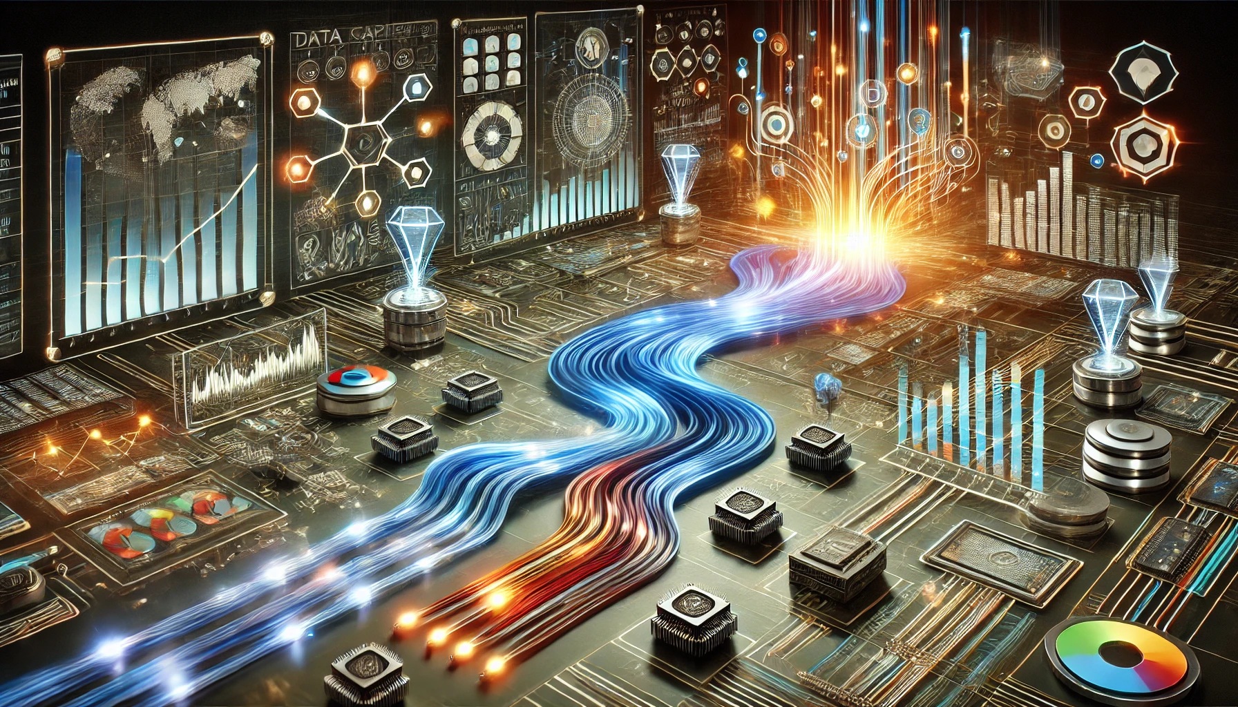
Data Visualizations
Creating effective data analysis and storytelling relies on visualizations and charts that can be made in a variety of software
With 15 years experience in healthcare, connecting with and caring for people is what I do.
The son of two wonderful nurses, I strive to improve my ability to help people
And how do I help?
By collecting, cleaning, analyzing, visualizing and presenting insights from your data to speed up and improve decision-making

Creating effective data analysis and storytelling relies on visualizations and charts that can be made in a variety of software
The basis of our analysis can involve descriptive statistics, visualizations, and inferential statistics. Not everything needs AI.
From data collection, cleaning, visualization, analysis, and communication we can end up using multiple programming or querying languages
Communicating and using the results of our analysis is another skill solved with a variety of tools
To monitor my house for free, I design and build an analytics pipeline in C++ and Python

To improve efficiency and equity of care, I analyze Synthea healthcare data, create a dashboard and make suggestions to reduce length of stay
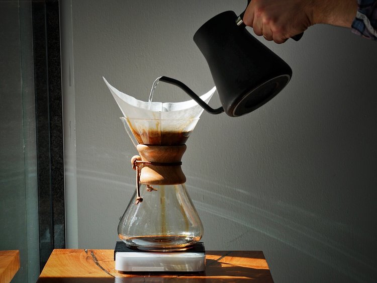
To suggest a product offering to investors, I look at survey data from James Hoffman and Cometeer's "Great American Coffee Taste Test" to create a dashboard aiding in customer segmentation
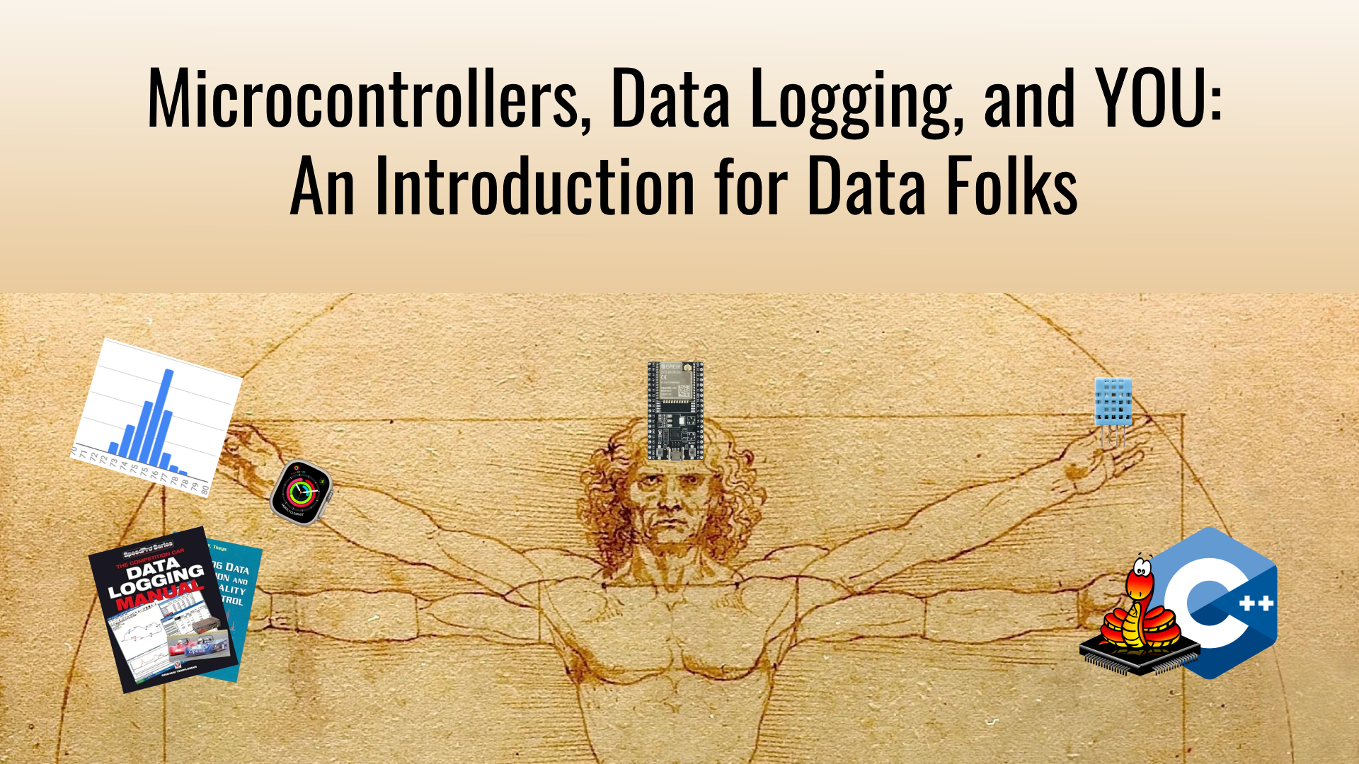
I try to inspire data analysts, scientists and engineers to use microcontrollers to collect, analyze and use their data insights
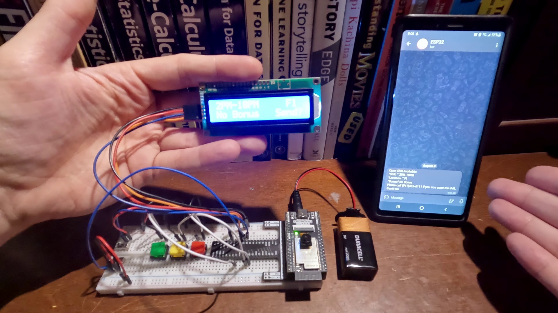
I provide code and demonstrate an improved version of a project meant to quickly send information to a list of employees to pick up work shifts